Role Product Designer II, partnered with Lead Design
Skills UX-UI design iterations, responsive design, prototyping, usability research, A/B testing
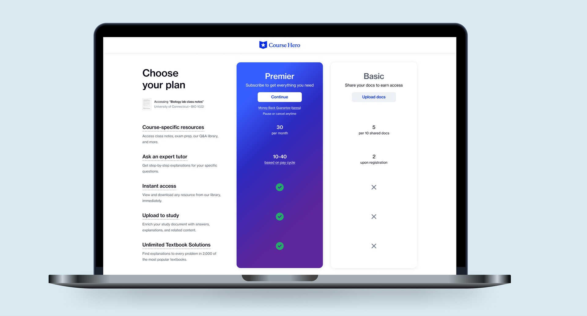
(Above) Legacy plan selection and purchase page
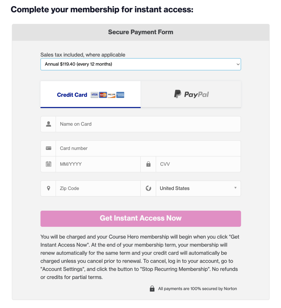
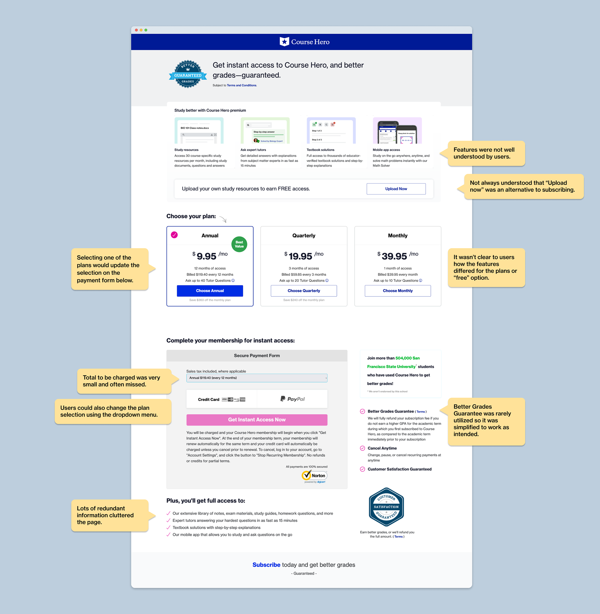
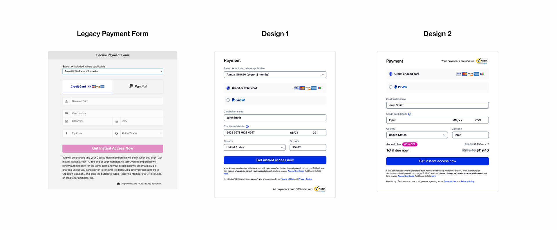
Legacy purchase form
For this design, I simply updated the UI style and some legal copy, keeping the dropdown selection in the form.
For the 2nd, I clarified the total price (calculating a discounted base price multiplied by 12 months) just above the call to action, and eliminated the dropdown field. Selecting a different plan duration above (annual, quarterly, or monthly) would simply cause the total to update.
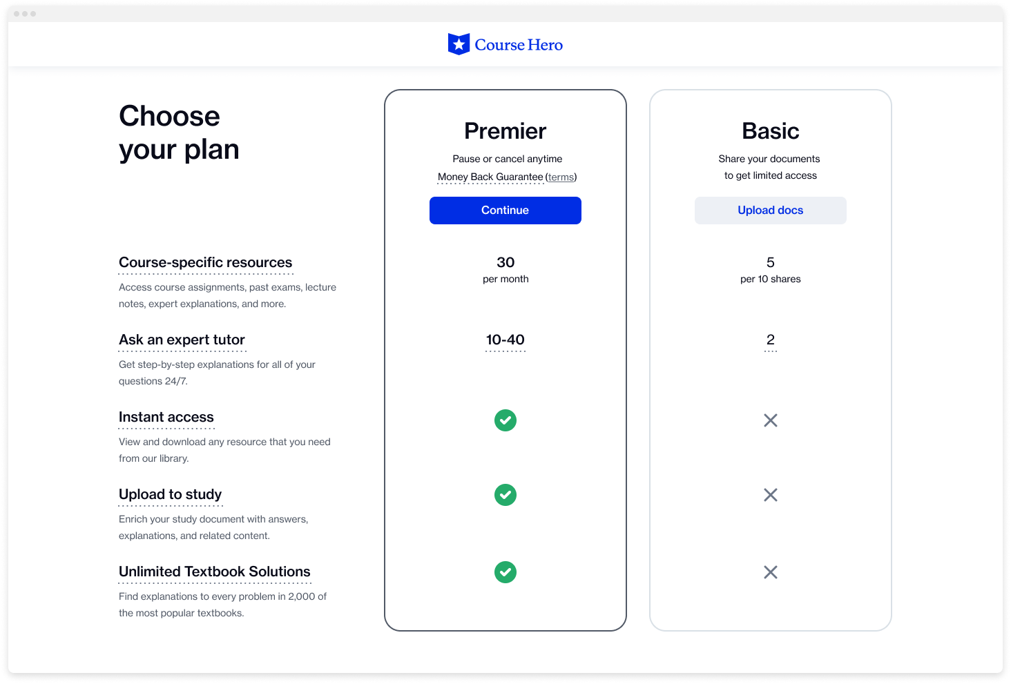
Design 1: Feature Table
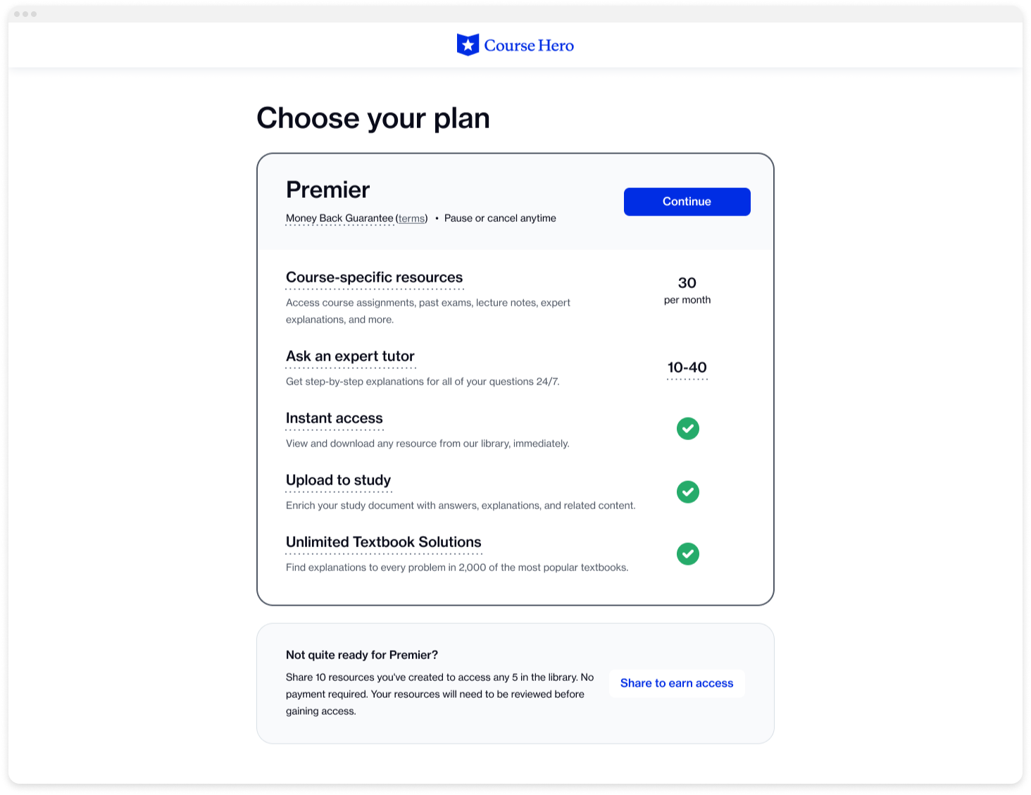
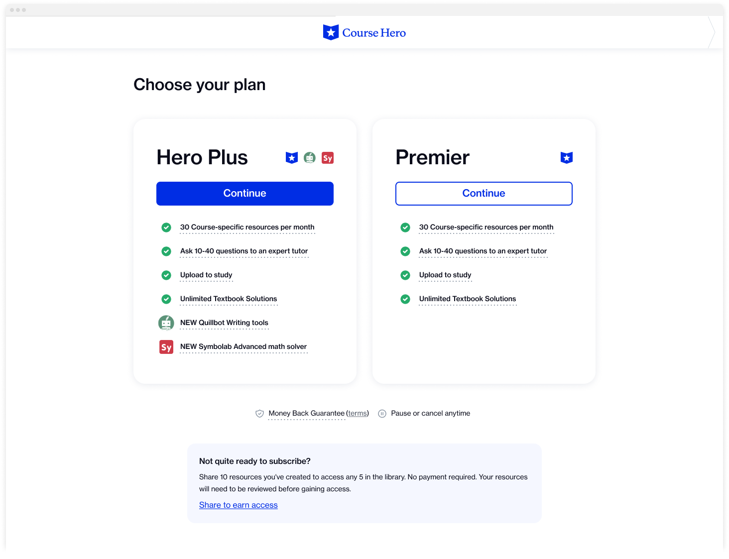
Design 2: Card

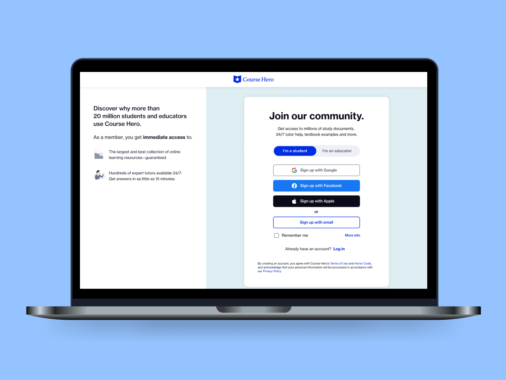
Checkout page
checkout-only page.
• It also made it difficult to ensure large enough touch targets
• Combining horizontal swiping, vertical scrolling, and touch targets was challenging
• Too many table interactions made it difficult to ensure that the screen was accessible
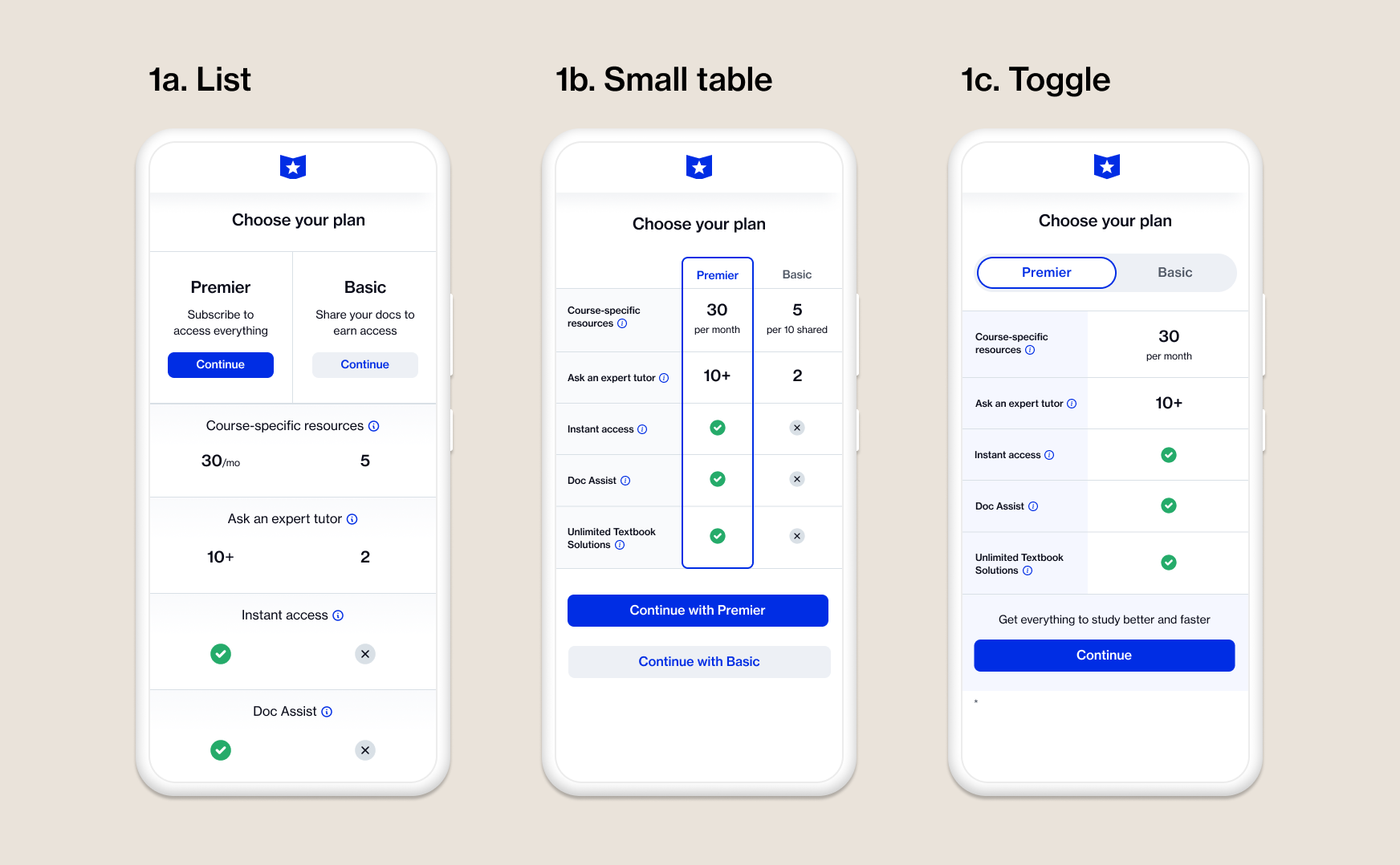
(Above) For Design 1: 3 different treatments were tested for the mobile web versions of the table.
(Above) Early iteration of table on mobile web with toggle button for Phase 2
(Above) Early iteration of table variation on mobile web in a list format for Phase 2

(Above) For Design 2, we tested a subtle callout to try uploading vs. a comparison card for Basic.
• Make the text "Share your docs" be more informative
• Use a carousel animation to list feature limits
• Add more visual emphasis to the feature popup link
(Above) Bundled plan in mobile list table with toggle button for Phase 3.
Phase 2 iteration of list table with toggle button, chosen for phasing in the bundled version for Phase 3.
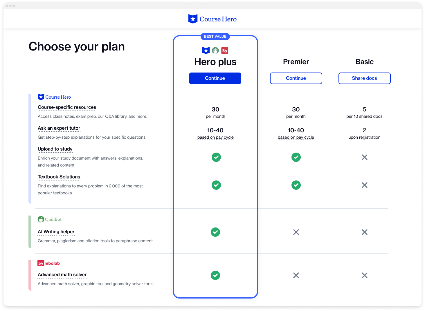

The winning experience for Phase 2 was a straight-to-checkout payment screen, with a separate page explaining the separate product benefits. The bundled plan was not included in this experience.

The final experience for Phase 3, with the bundled "Hero Trio" plan, selectable via a toggle switch.