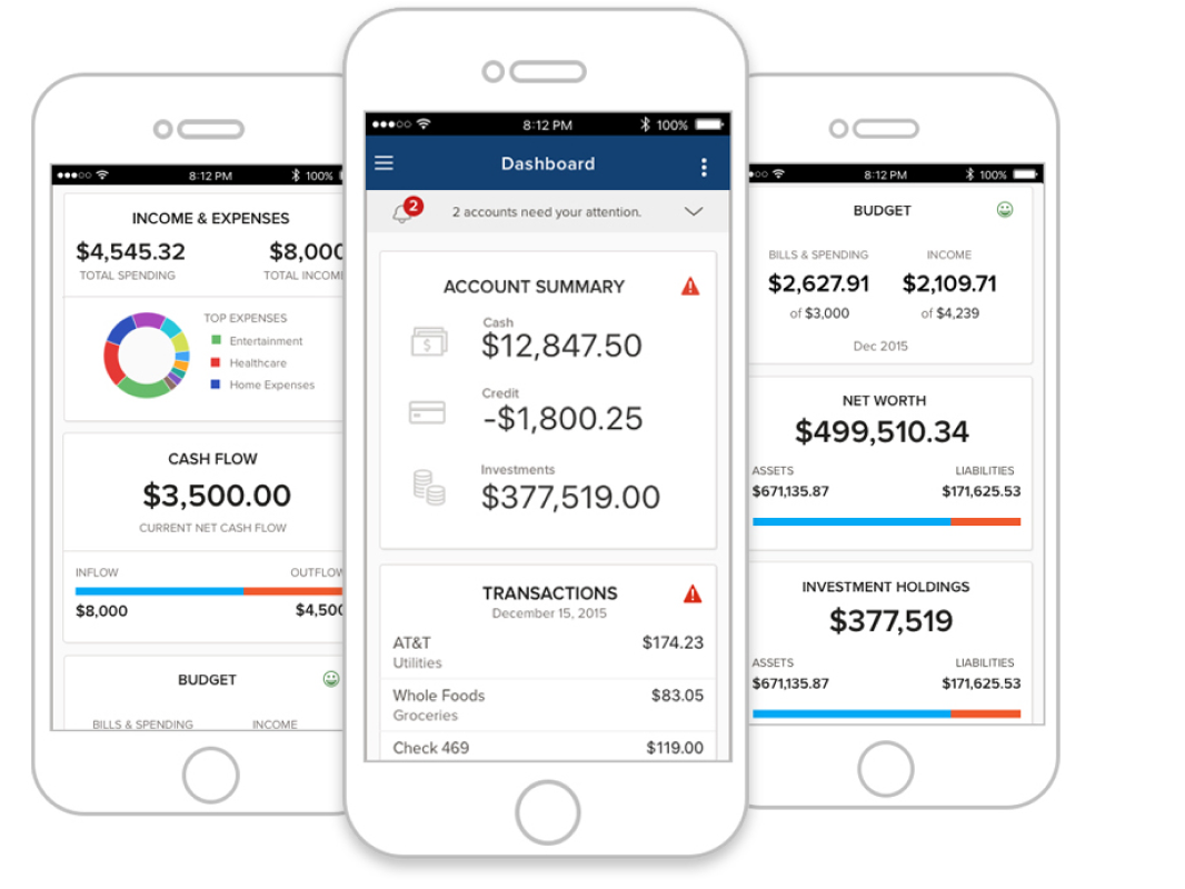
Building a scalable design foundation for Roostify

How I created a scalable, accessible design system that brought brand consistency to a configurable mortgage platform—and helped move a major client onto the core product
Role: Lead UI/UX Designer
Platform: Responsive white-label SaaS platform
Partners: Product Management, Product Design & Research, Front-End Engineering, Client Advisory Partners
Focus: Design Systems · Visual Design · Branding · Responsive UX · Accessibility · White-Label Configurability 


Skills: Product attributes, design principles, design systems, branding workshops, user journeys, personas, design system, web components, accessibility, WCAG standards
Creating a stronger core product
I led the creation of Roostify’s first design system, establishing a unified, accessible interface that could support different lender brands without requiring a separate product experience for each customer. The new system helped satisfy Chase’s requirements, enabling the company to move from a costly custom branch onto Roostify’s core product, while also supporting conversations with prospective customers including Guild, TD Bank, and Santander.
The work became more than a visual refresh—it created a scalable foundation for a growing mortgage SaaS platform.

The challenge
When I joined Roostify as its second product designer, the company was gaining larger lending customers, but its dated interface was becoming a competitive disadvantage. At the same time, its largest customer depended on a highly customized branch of the product that required significant ongoing maintenance.

How might we create one scalable product experience that feels trustworthy and consistent while allowing every lender to express its own brand?

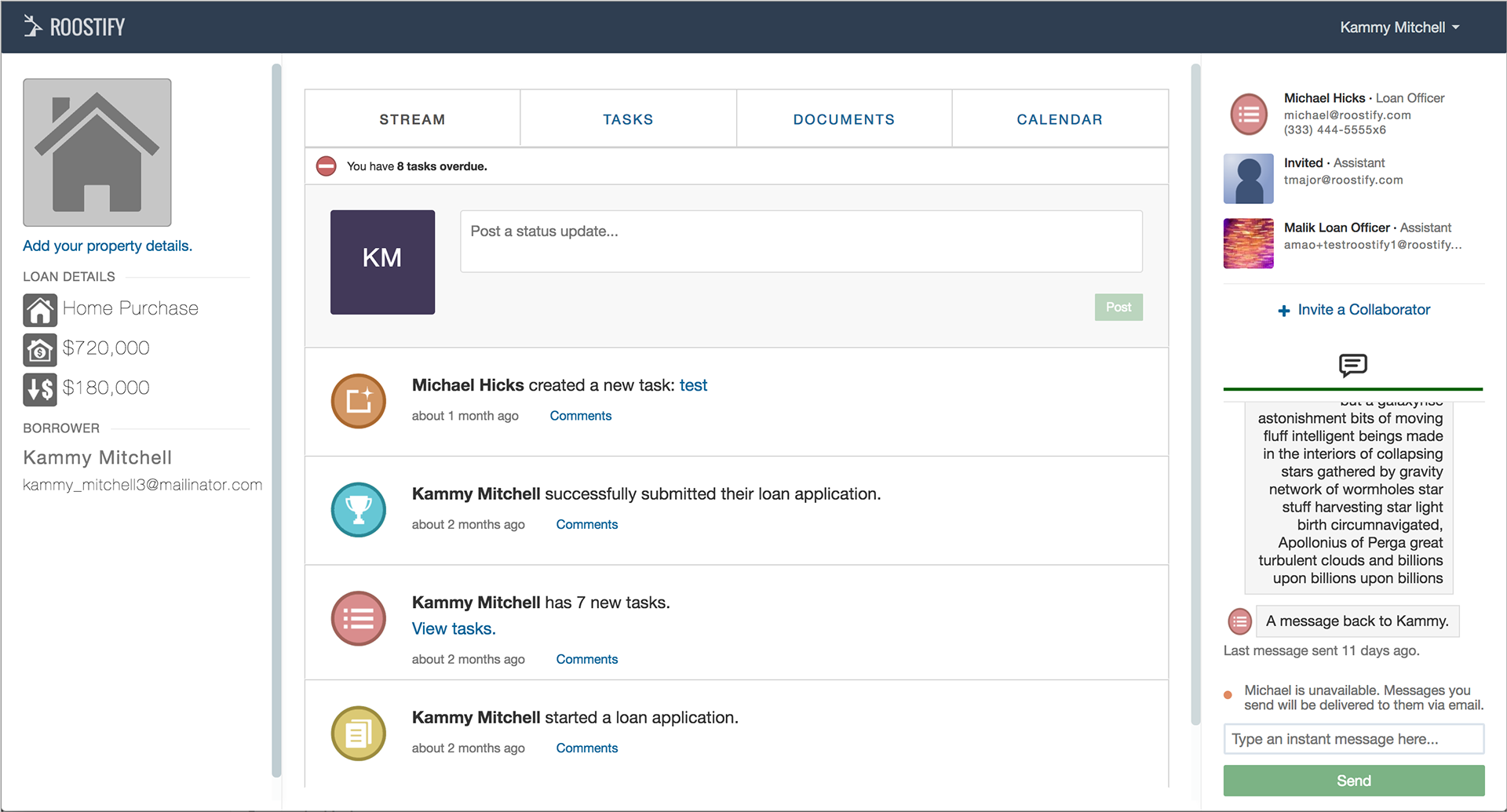
The legacy borrower task manager portal, before the atomic design system was introduced.

The new system needed to be brand-agnostic and configurable, responsive across devices, efficient for Engineering to maintain, and accessible enough to satisfy upcoming client and regulatory requirements. Chase partnered with us as an advisory customer throughout the initiative.
Defining the Design Language
Before designing components, we needed a shared visual direction. Working with Product and another designer, I helped facilitate product-attribute and visual-style exercises around four qualities: Prepared, Trustworthy, Collaborative, and Welcoming. Mood boards and style tiles allowed us to compare how those attributes could translate into typography, color, imagery, and interface treatments.
The team selected Trustworthy as the primary direction. That gave us a clear design lens for building the system instead of making visual decisions component by component.

The Roostify brand attribute statement guided the visual design direction towards representing the product identity..
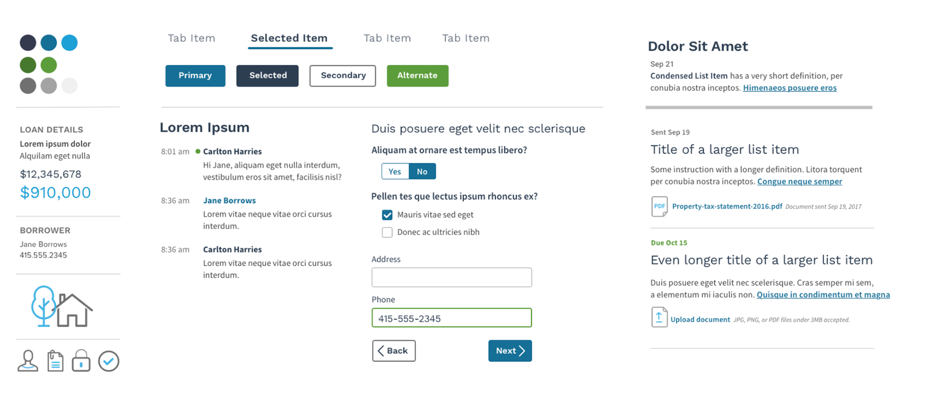
I created the "Trustworthy" attribute style tile​​​​​​​ with Open Sans, a friendly, round font, soft, rounded icons, neutral grey and cool-toned blue and green to communicate stability and trustworthiness. My research showed blue was the most popular color representing financial companies.
Building for white-label configurability
With the visual direction established, I planned the system in phases and divided borrower- and lender-facing work with another designer. We built foundations including typography, color, iconography, buttons, navigation, forms, alerts, messaging, and modals. Because Roostify was white-labeled, consistency could not mean making every lender look identical. I defined which attributes clients could customize—including logos, colors, links, buttons, and typography—while establishing defaults that would still create a cohesive experience when clients did not provide their own styles.
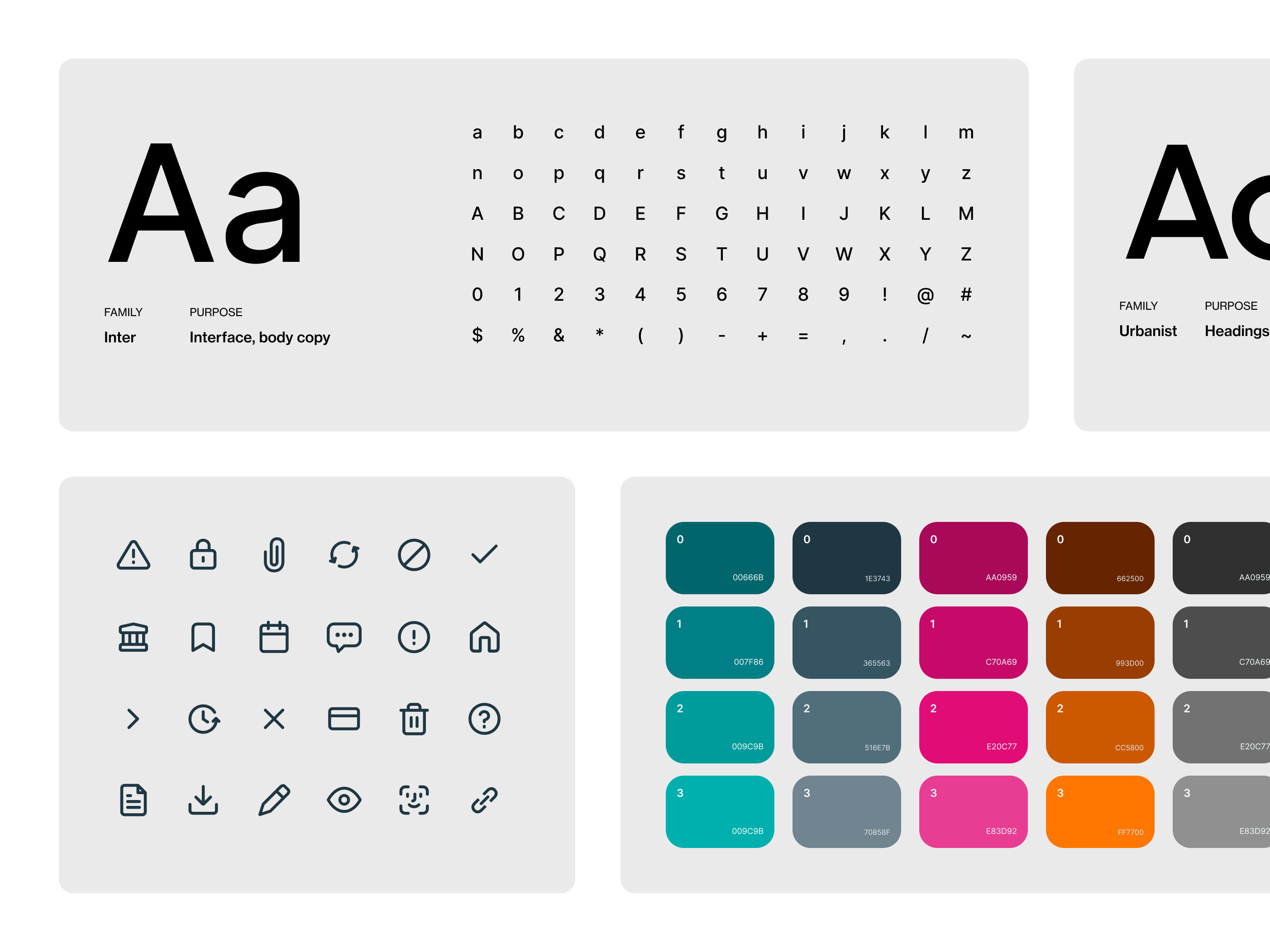
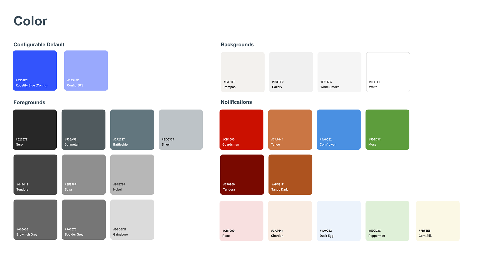
Color system with a configurable default used for primary buttons, neutral backgrounds, dark greys for headings and text hierarchy, and a functional color set for alerts and notifications
Balancing brand expression with interface utility
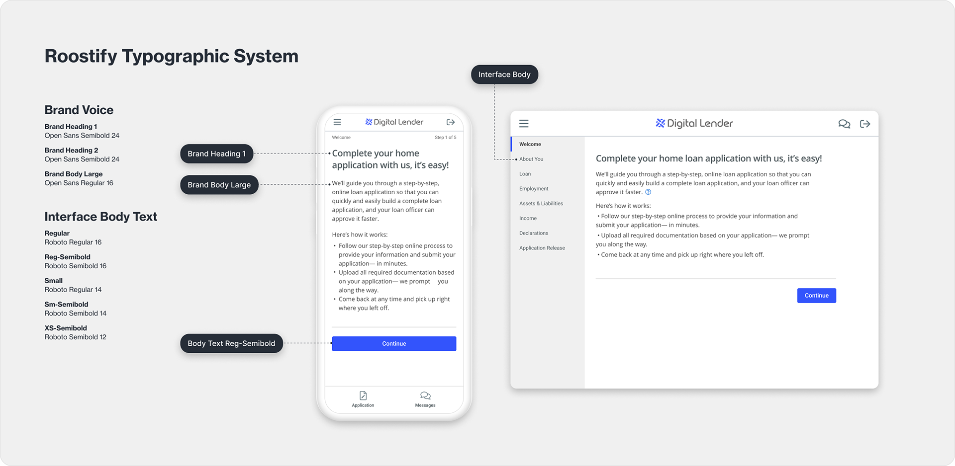
Typography was one example of how I balanced brand expression with usability. I reviewed the typefaces used across more than two dozen financial competitors and identified the five most common choices. I wanted the customer-facing mortgage intake experience to feel more like a guided conversation from the lender than a generic form, while the rest of the platform needed a highly readable, utilitarian typeface for dense inputs and account information. I chose Open Sans for prompts and questions, giving the guided intake a distinct brand voice, and Roboto for forms and functional UI. Clients could override those defaults with more brand-appropriate typefaces, but the underlying hierarchy remained consistent across implementations.
That decision also gave the interface a subtle visual rhythm: customers could distinguish the lender’s “voice” from the fields and controls they were being asked to complete, reinforcing hierarchy without adding unnecessary decoration.

The welcome screen in the borrower application portal, which is a series of questions to understand the purpose of the loan they are seeking. The typography, icons, primary button color, and top navigation are all configurable. 

Roostify app as configured for Chase bank's MyHome mortgage application.

Improving the product through better navigation
After completing the guided loan-application experience, borrowers transitioned into a task-management portal where they could track progress, complete assigned tasks, upload documents, review loan details, and communicate with their loan officer. This part of the product needed to support more ongoing activity and denser information, so the navigation had to scale beyond the linear structure of the intake flow.
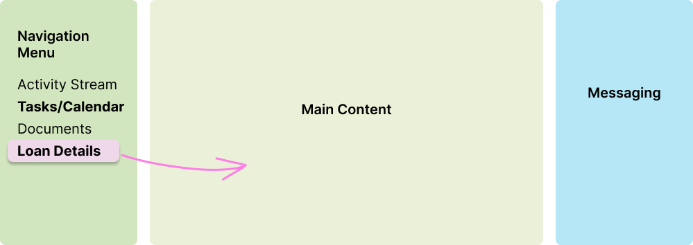
The legacy layout constrained the main workspace. A horizontal navigation menu was squeezed between two persistent side modules—loan details on the left and messaging on the right—even though neither module was relevant to every task. This reduced the amount of space available for the borrower’s primary content and made the navigation difficult to extend as the product grew.
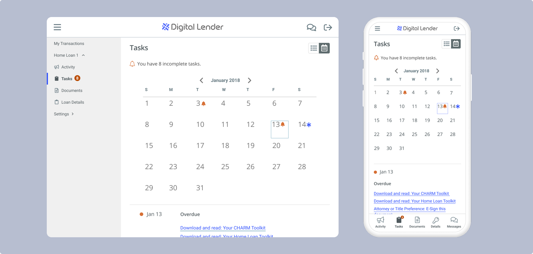
I redesigned the layout around a more scalable vertical navigation pattern. In both the borrower loan application experience as well as the post-application task manager, the main menu moved into the left column, while messaging became a collapsible side drawer that borrowers could open when needed. Loan and property details, which had previously occupied permanent screen space, became a destination within the navigation instead. This gave the central workspace substantially more room while keeping important information and communication readily accessible.
The new structure also translated more naturally to smaller screens, which was crucial for applicants who switched from their desktops to mobile phones during busy workdays while applying for loans. I applied the same navigation hierarchy to the mobile borrower experience, allowing sections such as Activity, Tasks, Documents, and Loan & Property Details to remain predictable across desktop and mobile while adapting the layout to the available space.
Before: A horizontal menu was compressed between persistent loan-details and messaging modules, limiting space for the borrower’s primary tasks.
After: I moved navigation into a scalable left-side menu, converted messaging into a collapsible drawer, and moved loan details into the navigation—creating more room for primary content.
Final borrower portal: Activity updates, task list and calendar views, uploaded documents, and loan/property details all use the same responsive navigation and visual hierarchy.
Accessibility and Engineering Alignment
Accessibility was a core requirement, not a final QA step. We used WCAG guidance while defining color, typography, controls, and interaction patterns, and the platform successfully passed multiple third-party accessibility audits.
I also established design principles and produced component guidance for designers and developers. The initial system was documented in Sketch with specifications and usage notes, then migrated to Figma in a later iteration to improve sharing and collaboration with Engineering.
Outcome
The Roostify Atomic Design System turned a fragmented interface into a cohesive, configurable product foundation. It strengthened brand consistency, improved responsiveness and accessibility, and reduced dependence on expensive client-specific customization.
Most significantly, the system helped make the core platform strong and flexible enough for Chase to migrate away from its separately maintained branch—demonstrating that design-system work could improve not only interface consistency, but also product scalability and business sustainability.
Clients who use the Roostify platform:

You may also like

Back to Top