UX Case Study: White Label Product Selector for Lenders
Sep 2018 - Apr 2019
Role Product Designer, partnered with lead Experience Designer, Reported to VP of Product
Skills User research & interviews, value proposition design, service blueprinting, user profiles, personas, user flows, user journeys, sketching, wireframes, prototypes
Role Product Designer, partnered with lead Experience Designer, Reported to VP of Product
Skills User research & interviews, value proposition design, service blueprinting, user profiles, personas, user flows, user journeys, sketching, wireframes, prototypes
Context
Roostify is a white-labeled SaaS product that lenders use as a customer-facing platform to process their borrower’s mortgage applications. The Product Selector for Lenders was an additional feature that served to empower Loan Officers with a faster rate comparison process, turning their leads into borrowing customers.
Roostify allowed borrowers to easily apply for a mortgage, upload documents, and securely communicate with loan officers while they transparently follow the mortgage application process. However, the loan officers were limited in what they could do with Roostify. Features existed to manage their pipeline, send messages and create tasks for borrowers, but they needed an easier way to share product and pricing information with them.
The Product Selector for Lenders is a digital lending platform experience allowing loan officers to access, model and share product and pricing options to borrowers, leading to increased overall loan conversions.
As the Senior Product Designer for this project, I worked closely with Product Managers and Engineering leads to participate in this service design initiative, conducted research, and synthesized the findings that led to this feature.
How might we facilitate an evolving financial decision-making process around product selection and fees for home mortgages, that positions the lender as a trusted advisor for their borrowers?
Design Strategy
Our goal was to produce a product and pricing feature with the ability to include fees and closing cost calculations that a lender could share quickly with customers and increase the overall speed of the borrower’s decision making process. To do this, we conducted ground research, gathering information from different sources, and utilized value proposition and service design methods to create a vision for a product that would fulfill our user’s functional, social, and emotional needs.
User research came from:
● Advisory board made up of clients: former LO’s & managers
● Subject matter experts within Roostify
● Customer profiles
● On site field interviews with loan officers, their managers and assistants
Research Insights
Our on-site user research showed us that loan officers, processors and underwriters use many tools to qualify borrowers for specific sets of loans. On site observations and interviews revealed the heavy overload of software tools they relied on to gather their customer's data, run conditional approvals, look up loan products, and make certain rate or pricing calculations. Additionally, we learned how important conversations were for loan officers to help them understand their borrower's goals. For instance, knowing how long they planned to live in their home, would help loan officers present the most relevant products.
(Above) Early research notes: Pains, gains, and jobs to be done for loan officers, processors, & borrowers.
Design Thinking Process
Customer Segmentation & Value Proposition Design
Customer profiles were created for borrowers, loan officers, their assistants, processors, and underwriters. The most common pains, gains, and jobs to be done among them were grouped into patterns and then labeled. I then created Customer Profiles & a Value map to match the product scope to our customers needs.
Service Design Blueprinting
I created simple user flows for potential conversations between loan officers and their borrowers. We then role-played scenarios to explore various borrower conversation flows and identify touch-points of data exchange.
We then consolidated our scenarios to 3 user flows, and then applied a service blueprint to each:
Shopping —Potential customers are just browsing, or shopping for rates.
Changes — Situations where an borrower is making changes to the application during the data gathering process.
Decisions — Situations with more than one borrower, where group decisions had to be made
Shopping user flow service blueprint
Focusing on the minimum amount of information necessary, I created user scenarios and touchpoint diagrams for potential conversations between loan officers and their borrowers.
Touch points were the places where interested borrowers gave just enough information to for loan officers to calculate a ballpark rate for the 3 best scenarios.
Journey map for various users
Ideation
Rapid sketching, with minimum info
Once the touch-points were established, I created wireframes to show the minimum required data inputs necessary for running Desktop Underwriter (DU: an automated underwriting engine) to meet the lender's conditions for issuing loans. Pulling from the 1003 (the FHA’s Uniform Residential Loan Application) inputs in the Roostify platform, I organized the data into groups, and then sections (below), keeping in consideration the ability for Loan Officers to edit some of this data.
Rapid sketching of eight 2-minute sketches of both input and product list output components.
(Below) Wireframes showing required loan criteria inputs.
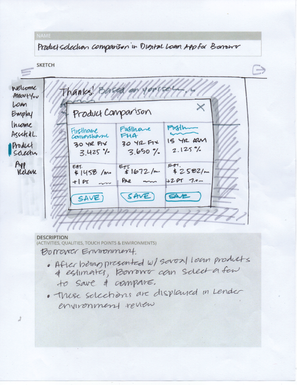
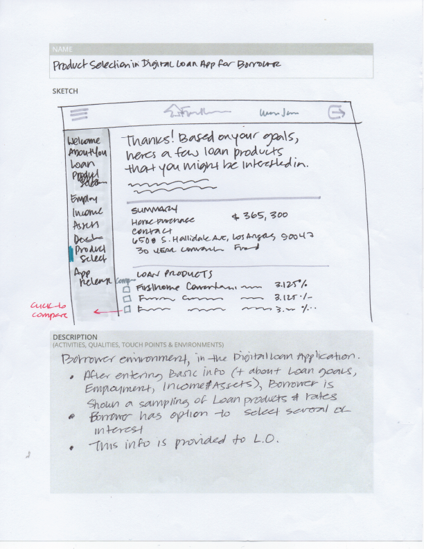
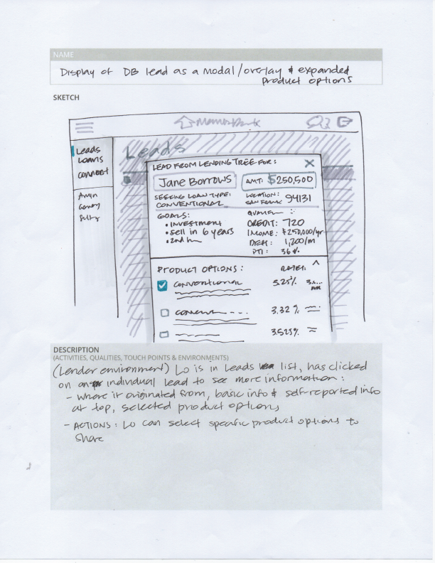
(Below) Sketches showing ways loan officers could share information to borrowers.
Insights
From our customer advisory group, we learned forms should be dynamically generated because some of the criteria entered would surface from different places, and we learned that having borrower's basic information pre-filled into the search criteria would save them crucial time.
And we also made the decision to allow the loan officer to start a product search directly from their loan applications list pipeline, by including it in a set of actions for each borrower in their list.
The platform also needed to be responsive for loan officers to use, in case they were outside the office.
(Above) Responsive intake form shown on mobile screens.
(Below) Search results page mobile explorations
Based on user feedback as well as technical and compliance requirements, I decided to separate inputs from results onto separate screens. The input form is dynamic, and the results are surfaced on a grouped, selectable data table with expanding rows to show more detailed fee information, as well as further actions to take on individual loan products.
Loan officers would also have the ability to send Fee calculation worksheets to their customers, giving them even more personalized and detailed estimates of the fees, monthly payments, and final closing costs.
Outcome
The Product Selector was successfully launched as an integrated product & pricing feature, and decreased the average time it would take for a loan officer to close on a loan, from several weeks to 7-10 days. Implementation of the feature contributed to a 30% to 100+% increase in loan conversions for our customers. This resulted in an increase in new customer contracts as well as extended renewals for existing ones.
