How improving trust, hierarchy, and progressive disclosure helped more students complete sign-up.
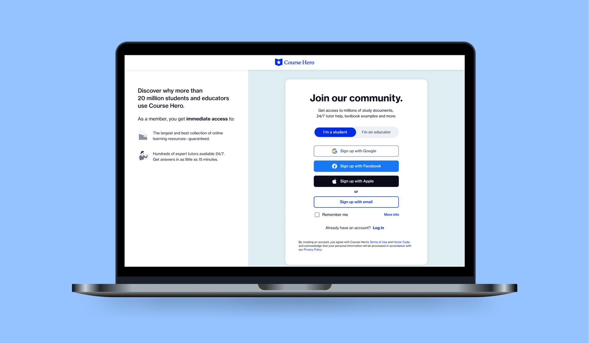
As a Product Designer II on Course Hero’s Growth team, I led design iterations, prototyping, and preparation for testing from early concepts developed by a senior designer. The redesigned registration experience simplified the path into the product across desktop and mobile, and increased registrations by 15%.
The problem: students were dropping out before they got started
Many students discovered Course Hero through search and arrived directly on study content, but accessing that content required registration. Research showed that one important point of hesitation was the request for school information. Students did not always understand why Course Hero needed it, and some were concerned that their school might be contacted.
Course Hero also had more than one way for students to register, including a standalone registration page and a flow presented over document content. Part of the redesign was creating a more consistent registration experience across these entry points, while reducing the amount of information students had to process at one time.
Video showing the legacy registration flow in a modal overlaying a course document.
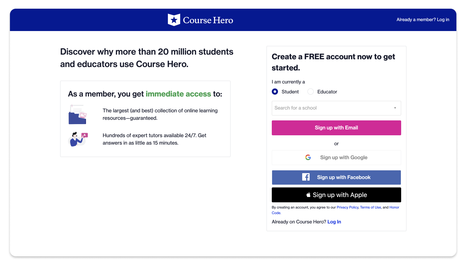
The legacy standalone screen, showing the first step of registration.
Using progressive disclosure to build trust
I moved school information later in the flow so students could first complete the basic account-creation steps. When we did ask for school information, I added a “Why do we ask for this?” explanation that clarified how the information supported personalization and reassured students about privacy. Progressive disclosure helped us reduce the initial burden without removing information the product still needed.

New registration sign up screen showing choice of signing up with email or signing up with social accounts.

Second screen of student sign up flow, showing inputs for email, password, and entering school name.

Same screen with “Why do we ask for this?” popup answer about personalization and privacy.
Testing how much context students needed
We tested different approaches to the registration experience, including the document-overlay flow and a standalone page with supporting benefit information. The standalone experience performed better in that experiment, suggesting that students benefited from a more focused registration path with enough context to understand the value of signing up. The test also challenged our assumption that a more unified pattern would necessarily perform better across every entry point.
The final designs for logging in for desktop and mobile are shown in the videos below.
Video showing Sign up screen toggle interaction and progressive disclosure, popup and Sign in experience.
Video of Sign Up and checkout experience on mobile.
What I learned
This project reinforced that reducing friction is not simply a matter of shortening a form. The strongest improvements came from understanding where users hesitated, changing when sensitive information was requested, and providing context at the moment it was needed. For me, it was a useful reminder that conversion and trust are closely connected: sometimes the clearest path forward is not fewer words or fewer steps, but better timing and explanation.