How I redesigned appointment scheduling around customer priorities—helping customers find the right time or location, discover self-service options, and give bankers better information before they met.
Role: Product Designer
Timeline: Jan - Aug 2022
Partners: Product Management, Engineering, Research, Banking stakeholders
Focus: Interaction Design · Workflow Design · Responsive UX · Self-Service · Prototyping
The challenge
Wells Fargo’s appointment scheduler needed to better serve both customers and bankers. The legacy tab-based form was difficult to navigate, and pandemic restrictions had increased reliance on online scheduling—along with customer and banker complaints.
The problems extended beyond the interface itself. Some customers struggled to find appointments that fit their schedules, while bankers reported that customers were booking appointments for services they could complete themselves online. Bankers also wanted more information about customer needs before an appointment so they could prepare and provide more efficient service.
The design challenge: How might we make appointment scheduling work for customers with different priorities while reducing unnecessary appointments and helping bankers better prepare for the ones that matter?
Understanding two types of customer intent
Earlier research revealed an important distinction: customers approached scheduling with either a location-based priority or a date-based priority.
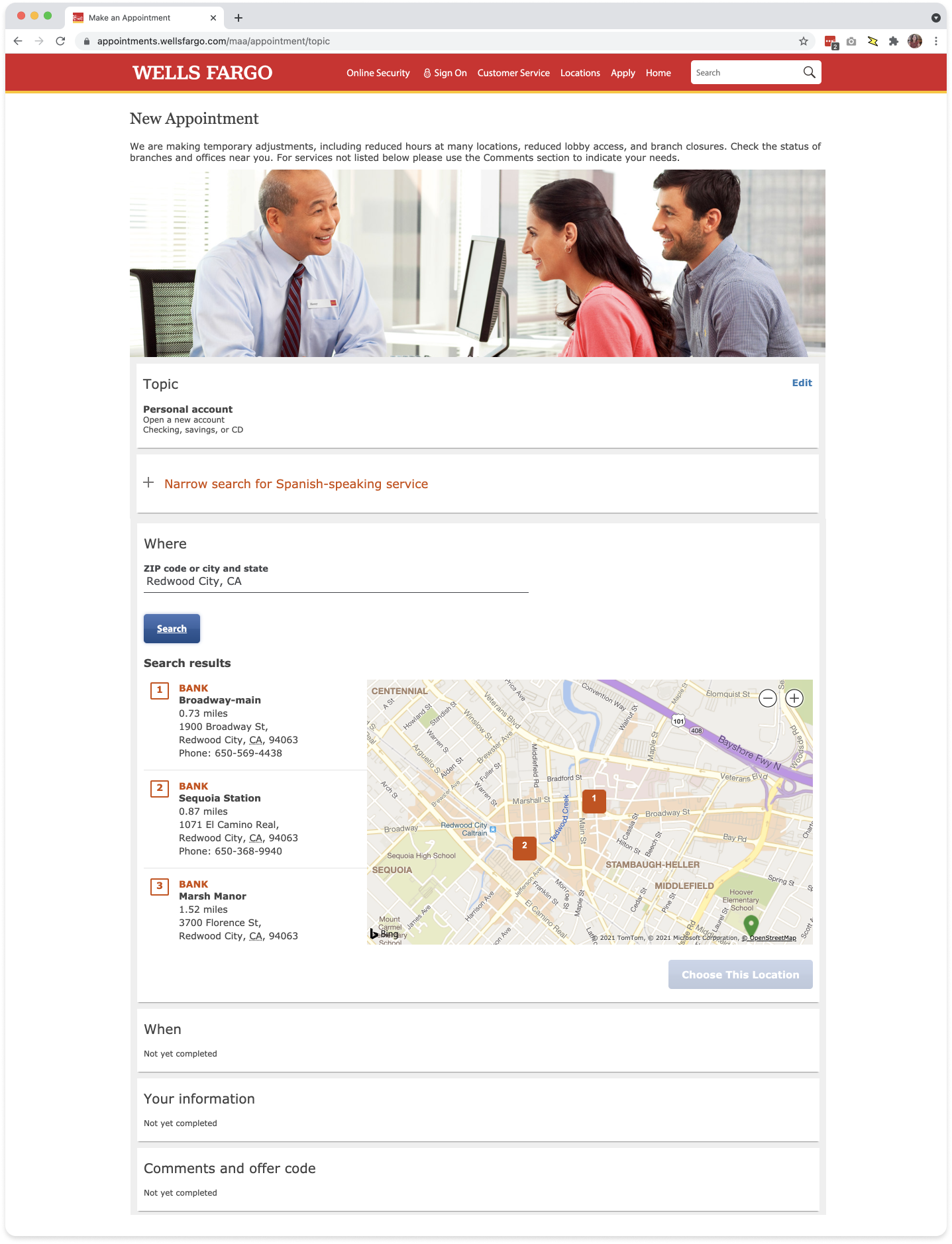
The existing flow worked primarily for location-driven customers. Users selected a branch first and chose a date and time later—only to discover that their selected location might have no appointments available when they needed one. Date-driven customers were forced to repeatedly try different branches until they found availability.
This insight became central to my redesign: rather than making customers conform to a predetermined sequence, the experience needed to accommodate both priorities.
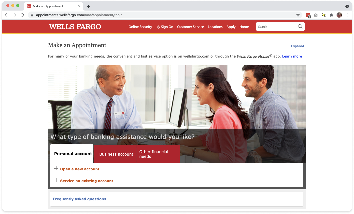
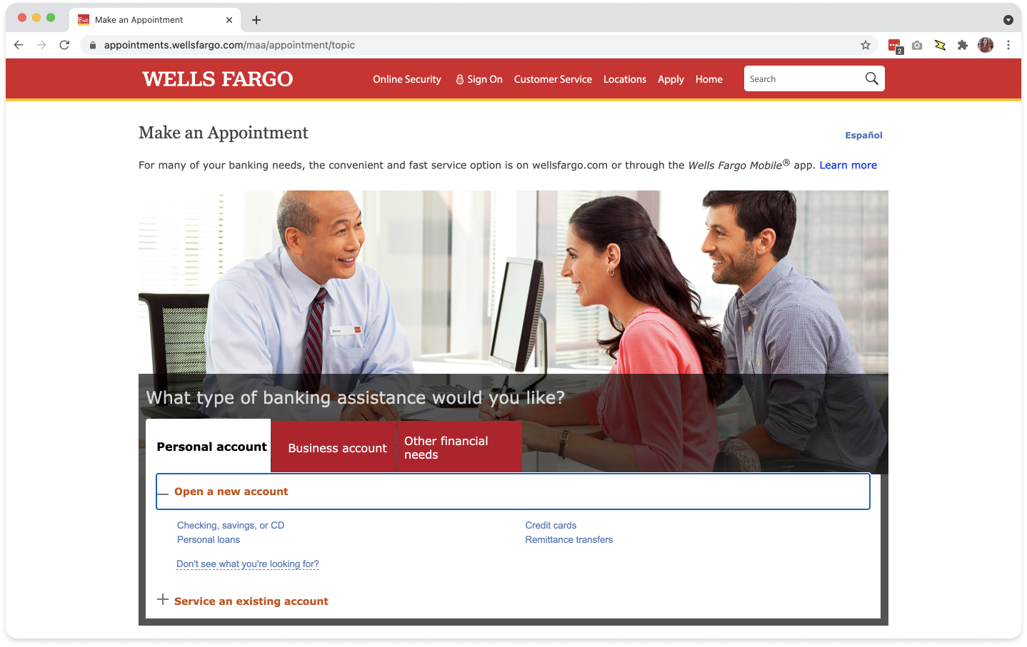
(Below) The original appointment online experience in a tab-formatted vertical form would expand each step in a downward direction as the user progressed.

Rethinking the flow around customer needs
I started with the overall UX flow before addressing visual design. Signing existing customers in earlier allowed the experience to surface appointment topics relevant to their accounts and gave bankers more useful information about the reason for the visit.
I replaced the legacy tab structure with a progressive form that focused customers on one decision at a time while maintaining a visible summary of their selections. I also reconsidered how information such as appointment reason and additional comments could help the assigned banker understand the customer's needs before they arrived.
Reducing unnecessary appointments
One of the most valuable opportunities was helping customers recognize when they didn't need an appointment at all.
When customers selected certain appointment reasons, the experience could surface contextual information or direct links to relevant self-service options—such as comparing checking accounts or applying for a credit card online. Customers could resolve straightforward needs immediately rather than waiting for an appointment, while bankers could devote more time to customers whose needs required personal assistance.
Designing around date and location priorities
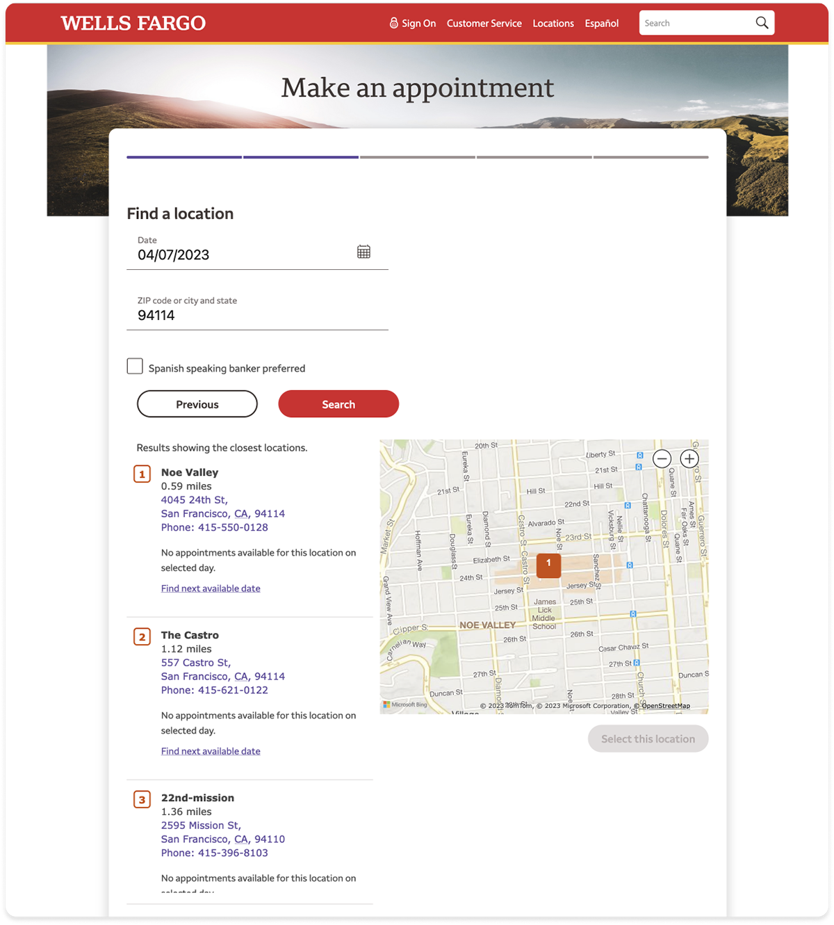
The most significant interaction change combined date selection and branch availability into a more connected experience. Working with Engineering, I designed the flow so customers could select a desired date and see which nearby branches had appointments available that day.
When a preferred branch had no availability, customers could search for that branch's next available appointment instead. This supported both behaviors: date-driven customers could compare locations for a specific day, while location-driven customers could remain with their preferred branch and find another date.
Once a location was selected, customers could compare available appointment times for the selected date and following two days.


(Below) A list shows several branches on a Friday have no available appointments that same day. Users can choose to find the next available date for one of the locations, or else try a different date to see the list again.
Connecting date, location and availability
Once a customer selected a branch, the experience needed to make it easy to understand availability without repeatedly moving back and forth through the scheduling flow. I designed a three-day view centered around the customer’s target date, allowing them to compare nearby appointment availability at the selected location.
Navigation controls allowed customers to move forward or backward through additional dates without restarting their search. This created a more continuous experience between choosing a location and finding an available appointment, while supporting customers who had some flexibility around their preferred date.
(Below) Once a location is selected, customers can compare appointment availability across a three-day range and navigate to earlier or later dates without restarting their search.

Designing a scannable time picker
A technical constraint required every available appointment time to be presented as an individual radio-button option. At the same time, customers needed to compare availability across a three-day range—their selected date, plus the day before and the day after—without the interface becoming overwhelming, especially on mobile.
I designed the time picker to prioritize scannability within those constraints. On desktop, available appointments were grouped into morning and afternoon columns beneath each day, making a large number of time slots easier to compare. On mobile, those same options collapsed into a single vertical column to preserve readability and touch-target spacing. Appointment durations could vary between 30 and 60 minutes depending on the selected reason, and unavailable times were simply omitted rather than shown as disabled options.
The selected date anchored the three-day view, while navigation controls allowed customers to move the range backward or forward without restarting their search. This gave customers a compact way to compare nearby dates and times while keeping the interaction responsive across screen sizes.
(Below) The mobile experience reorganized the same scheduling options into a single-column layout for easier scanning on smaller screens.

Outcome
The redesigned Make an Appointment experience successfully launched on Wells Fargo’s website and addressed pain points for both customers and bankers.
The new flow supported customers with different scheduling priorities, surfaced self-service options before unnecessary appointments were booked, and gathered more relevant information to help bankers prepare. Progressive disclosure also transformed a confusing tab-based form into a clearer step-by-step experience across desktop and mobile.
The project reinforced that improving a scheduling experience is not simply about making it easier to book a time. The better solution was helping customers determine whether they needed an appointment at all—and, when they did, making the experience flexible enough to reflect what mattered most to them.