How I helped mature a fragmented design system into a more scalable Figma architecture using variables, reusable components, and shared documentation.

Role: Product Designer / Senior Product Designer
Focus: Design systems, Figma variables, component architecture. accessibility, documentation
Team: Design manager + 2 Product Designers
Outcome: ~40% reduction in redundant design-library components
The Challenge
Prosper's Shape design system had grown across several financial products, but the system itself had become increasingly difficult for designers to navigate and maintain. Multiple Figma libraries were in use, legacy and current styles existed side by side, components were duplicated or incomplete, documentation was fragmented, and design and coded components were not always easy to reconcile.
My work on Shape began while I was a contractor and continued after I joined Prosper full-time as a Senior Designer. The first phase focused on reducing ambiguity and design debt; the later phase focused on evolving the system into a more scalable Figma architecture using variables, reusable components, and richer interaction behavior.
Phase 1: Simplifying the foundation
I began by identifying places where inconsistency was slowing designers down. I consolidated and reorganized typography so active and legacy styles were easier to distinguish, refined the color system by reducing redundant values and clarifying accessibility guidance, and helped standardize icon sizes and usage. I also improved documentation so designers could find important usage and accessibility information closer to where they were working.
This cleanup gave the team a more coherent foundation to build on. It also helped reduce redundant design-library components by approximately 40%, creating a clearer starting point for the next phase of the system.
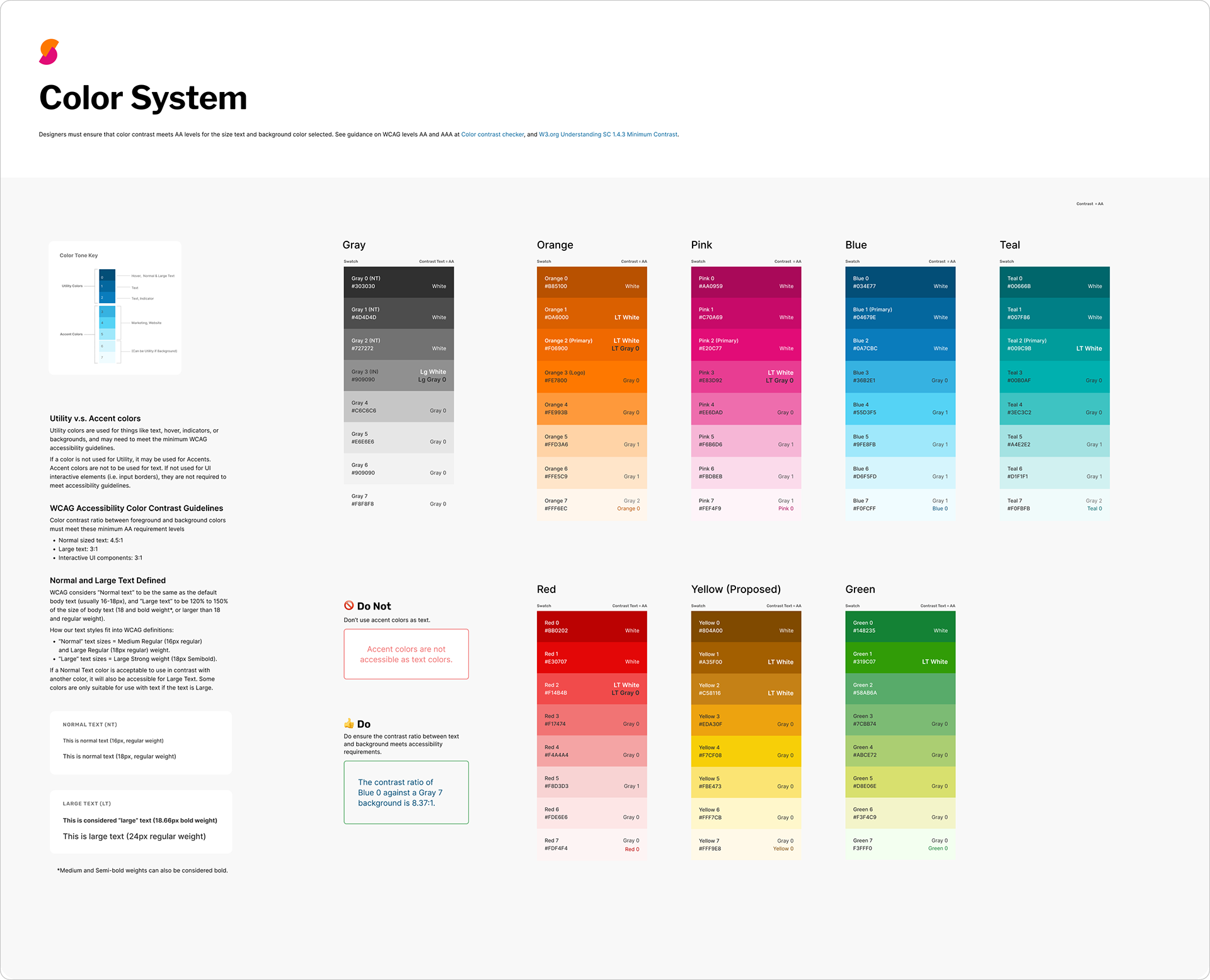
The first iteration of the revised color system, before the transition to the future brand styles.
Phase 2: Building for scale with variables and tokens
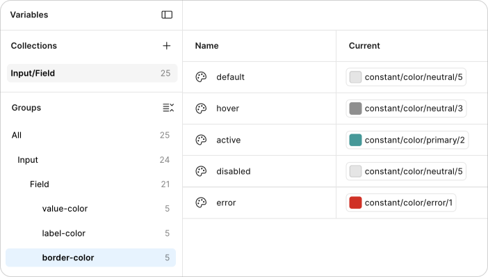
As Shape matured, we began moving beyond static styles toward a more systematic variable architecture. I worked with foundational variables for typography, color, spacing, measurements, breakpoints, dimensions, screen widths, padding, and radius, helping create name/value relationships that could support reusable tokens and future modes.
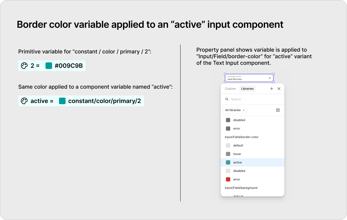
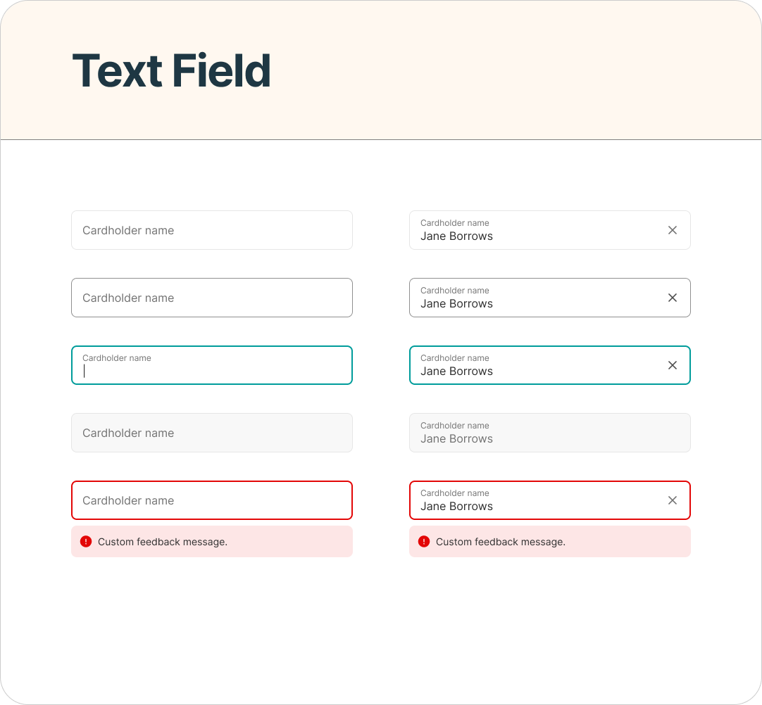
In reconstructing this later phase for my portfolio, I focused on the Inputs category I worked on most directly. The Text Field component demonstrates how foundational primitive values can flow into more meaningful component-level decisions, helping reduce one-off styling and making the relationship between system foundations and product UI more explicit.
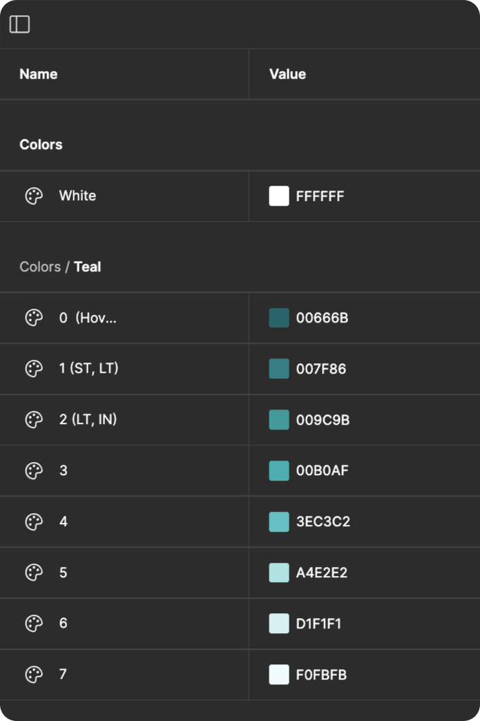
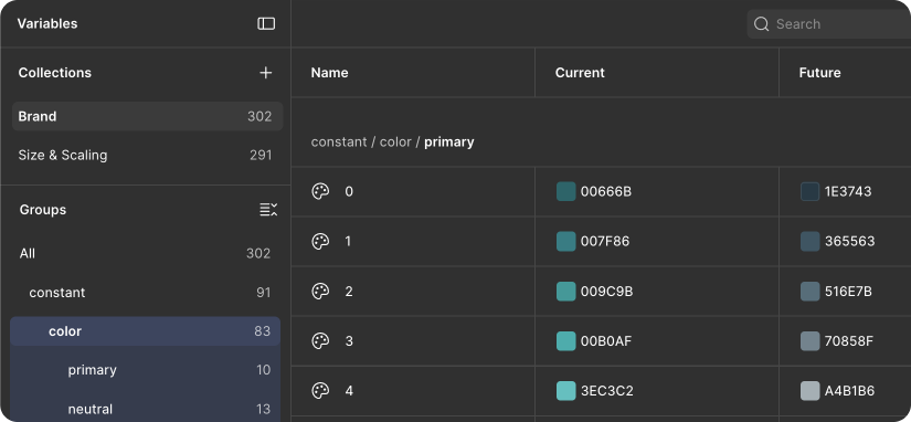
A "future" mode was added to the variables to make the shift from the current to the new brand easier.
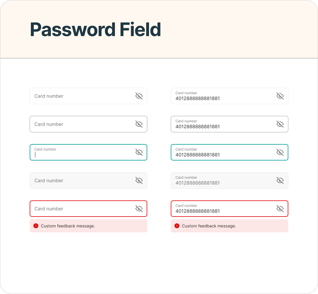
The next step was applying those foundations to actual components. I worked on core input patterns including Text Field, Password Field, Select Field, and related feedback states, using shared variables to control properties such as typography, color, spacing, borders, and measurements.
Rather than treating each field as an isolated component, I approached the Inputs category as a family of related patterns. Shared structures and naming conventions made it easier to maintain consistency across default, focus, filled, disabled, and error states while still supporting the differences required by each input type.
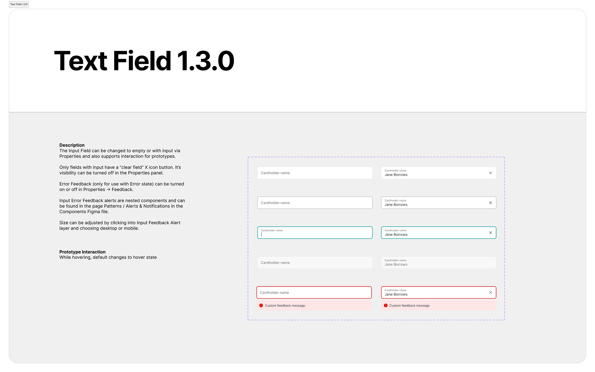
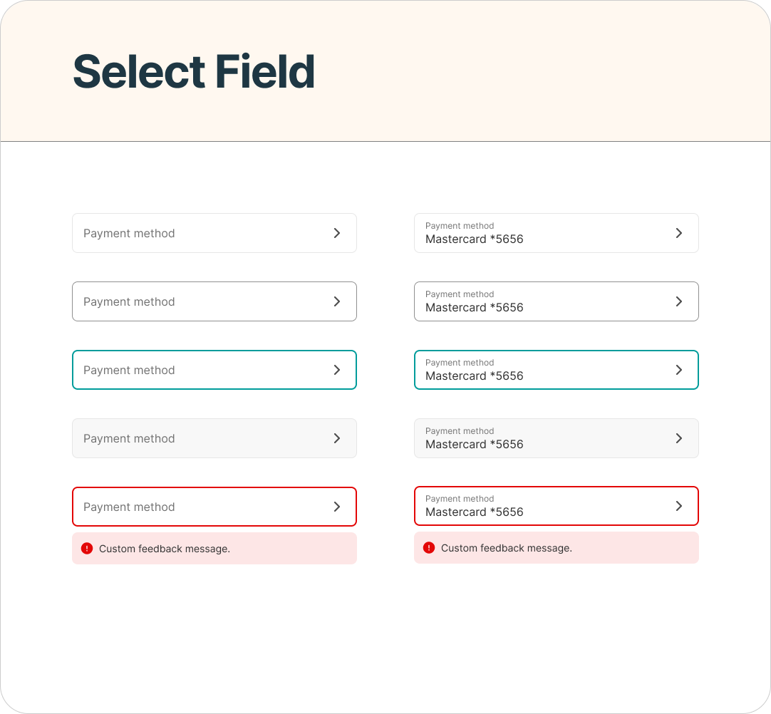
After joining Prosper full-time, I also added interactive prototype behaviors so components could better demonstrate how they were intended to respond during real product use.
For input components, this meant showing transitions between states such as focus, entry, validation, and feedback. These prototypes gave designers a more realistic reference for interaction behavior and provided engineering partners with additional context beyond static specifications.
Alongside the component work, I created and refined documentation covering anatomy, states, usage guidance, and accessibility considerations.
Across Shape more broadly, I also helped consolidate guidance in ZeroHeight, bringing together visual examples, accessibility information, dos and don’ts, and references to corresponding front-end implementations. The goal was to make the system a shared source of guidance for both designers and engineers, rather than simply a collection of Figma assets.

Accessibility reference page in Prosper's Brand Style Guide.
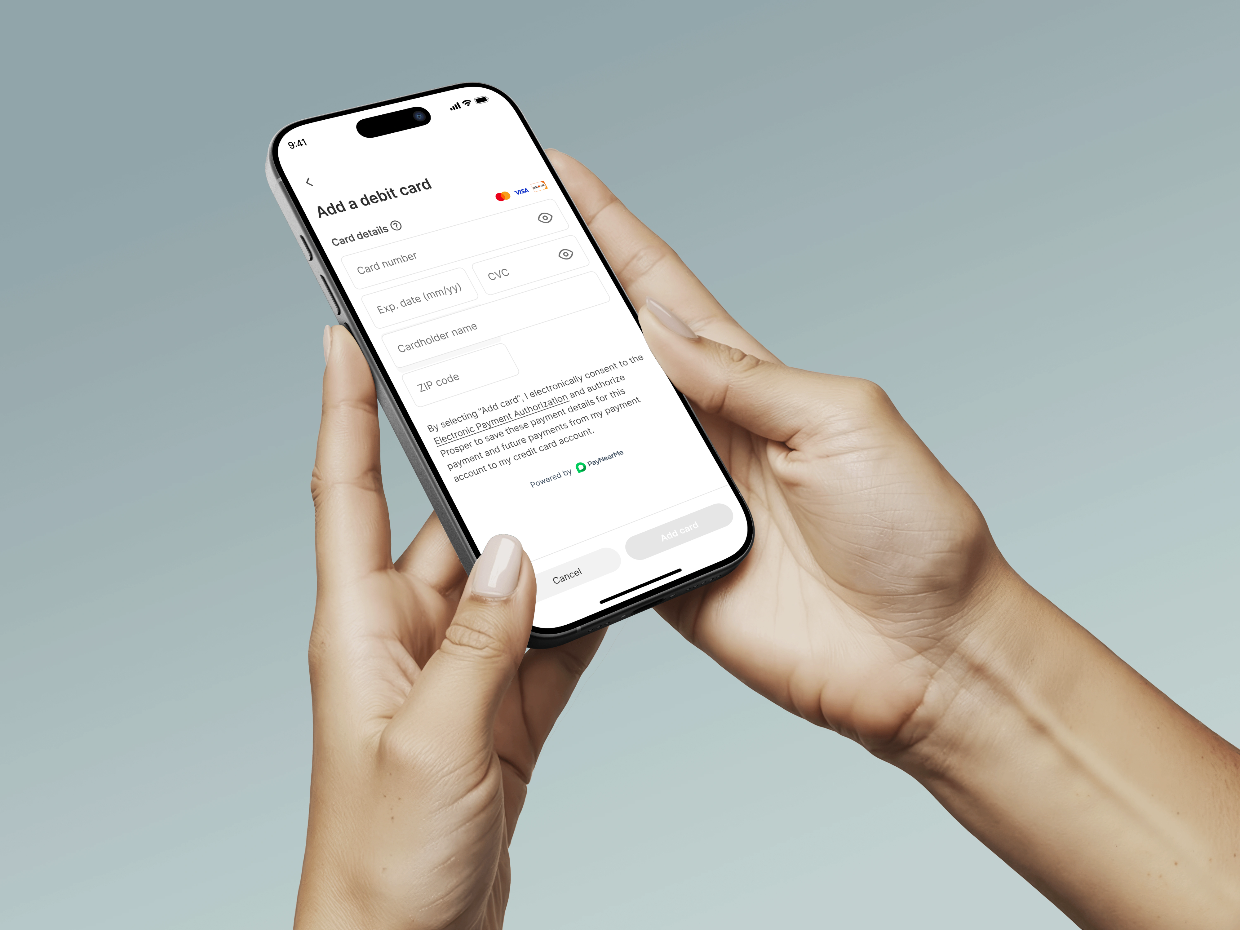
The value of the system became most visible when the same components were used in real product experiences. Many of the input and feedback patterns I worked on were applied in Prosper’s payment flows, including experiences for adding and managing payment methods.
This connection between the library and shipped product work reinforced an important principle: design-system decisions should make product delivery easier, not exist separately from it. Reusable components, shared variables, and consistent interaction patterns helped designers work from the same foundations while supporting closer alignment with engineering.
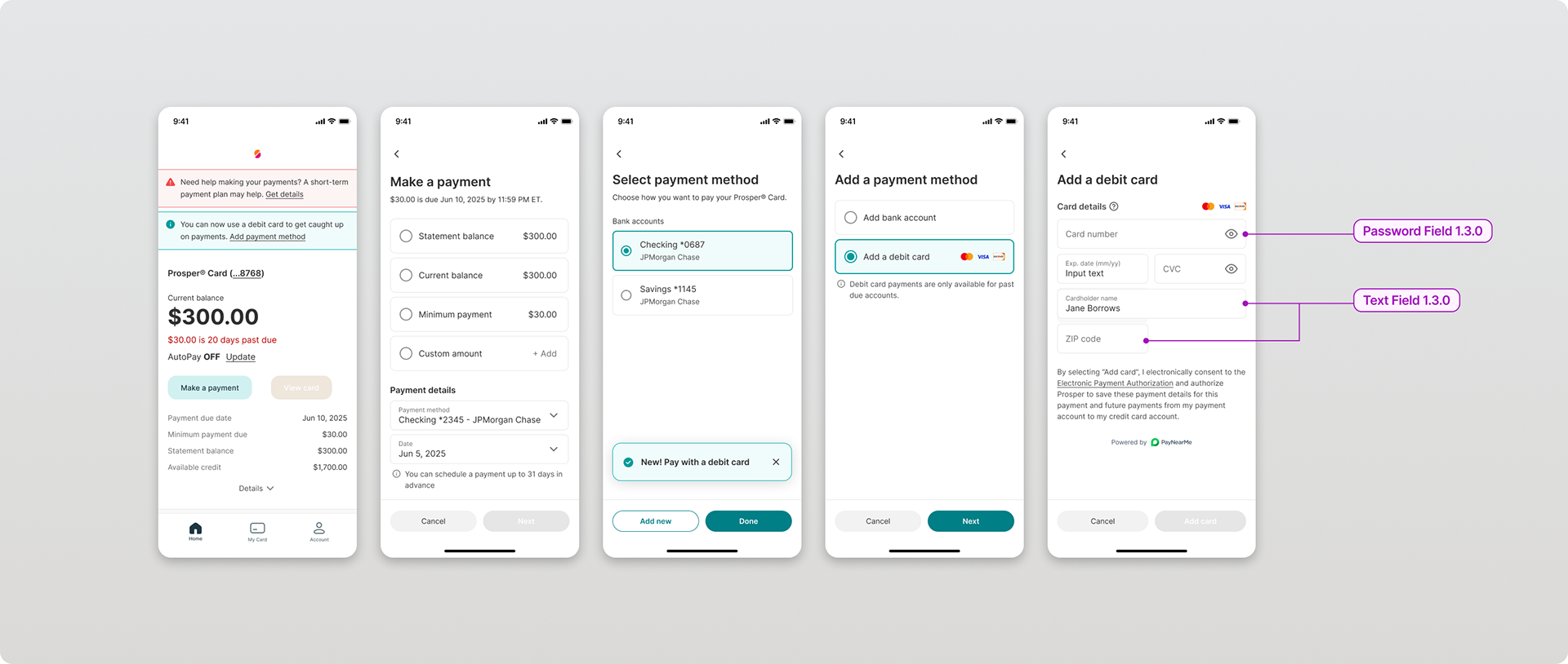
Input components used within the product.
Outcome
The work helped evolve Shape from a fragmented collection of design assets into a more organized and scalable system of foundations, components, documentation, and shared patterns. Early cleanup reduced redundant design-library components by approximately 40%, while the later phase strengthened the system through variables, token-ready foundations, reusable input components, and richer prototype behavior.
The project also reinforced what I value most about design systems: they are not simply libraries of reusable UI. At their best, they create a common language for making decisions, maintaining quality, and helping designers and engineers deliver consistent experiences more efficiently.