How I helped expand an ACH-only payment experience with debit-card payments giving delinquent customers more flexibility to bring their accounts current while supporting Prosper's broader goal of reducing charge-offs.
Role: Senior Product Designer, Payments
Platforms: Responsive web, native iOS & Android
Partners: Product Management, Front-End & Back-End Engineering, UX Research, UX Writing, Card Product Design, Fraud/Verification, Payment platform vendor
Focus: Payment UX · Interaction Design · Usability Testing · Cross-Platform Design · Design Systems · Engineering Collaboration · Implementation & QA
Impact
• Launched debit card payments to 100% of eligible customers
• Helped reduce credit card charge-offs below the company's target
• Influenced a faster payment posting experience that improved customer value perception
A financial services company wanted to give customers more flexibility in how they made payments by introducing an additional digital payment method across its servicing experience.What initially appeared to be a simple addition affected the entire payment journey. Eligibility changed with a customer’s account status, and customers could already have pending or scheduled payments. The experience also needed to support adding, selecting, verifying, expiring, and removing debit cards—while preventing duplicate payments and remaining consistent with the existing ACH experience.
My role was to map these interconnected states and translate payment rules into an experience that clearly guided customers through what they could do, what would happen next, and how their choices might affect existing payments.
I began by mapping where the new payment method would appear throughout the existing experience and identifying the states, decisions, and edge cases that could affect the customer journey.
Working closely with product and engineering, I explored how customers would select and manage payment methods, understand their available options, resolve errors, and move successfully through the payment flow.
Rather than treating the work as a single new screen, I approached it as an extension of the existing payments system. This helped us identify opportunities to reuse established patterns while introducing new interactions only where the additional payment method required them.

The original add a payment method experience was limited to only one kind: bank accounts.

The previous ACH payment only user flow for adding a bank account.
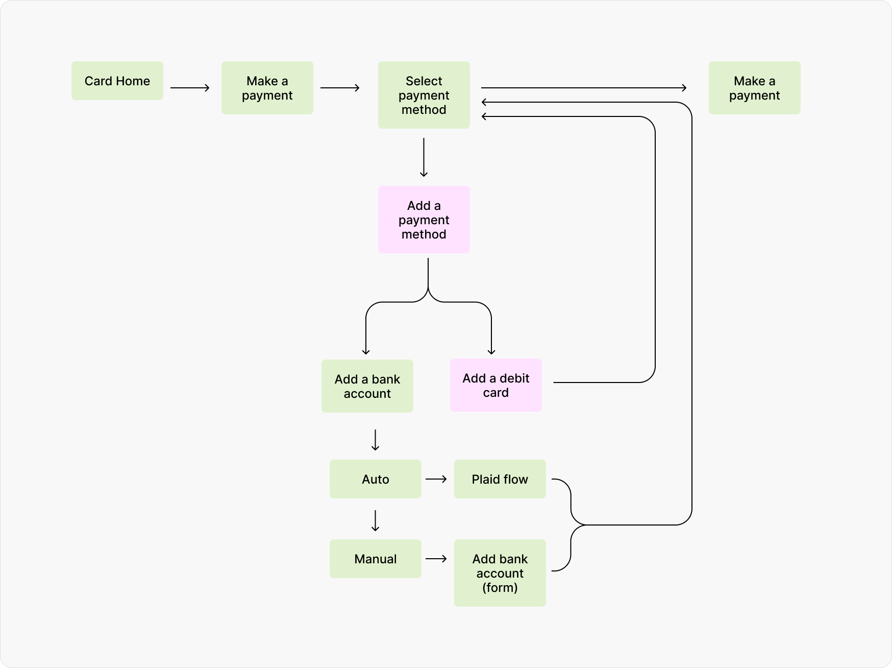
The new user flow for adding a debit card. This direction required an interstitial "add payment method" screen to let users choose between adding a bank account or adding a debit card.
Financial transactions can create moments of uncertainty, particularly when an action is unavailable, unsuccessful, or requires additional customer attention. I designed the experience to clearly communicate what customers could do at each stage and what they should expect next.
I also considered responsive behavior, accessibility, error handling, and reusable patterns so the solution could work consistently across the broader servicing experience.

Notifications alerting customers of their ability to use debit cards for payments surface at key touchpoints.
Adding a new payment method surfaced an opportunity to simplify the existing component architecture by unifying the patterns for selecting payment methods and managing saved accounts. While I explored a more flexible shared component, implementing it would have required broader research and engineering changes outside the project’s scope. I ultimately preserved the existing patterns and prioritized delivering the new payment experience successfully—a reminder that good systems thinking also means knowing what not to change yet.
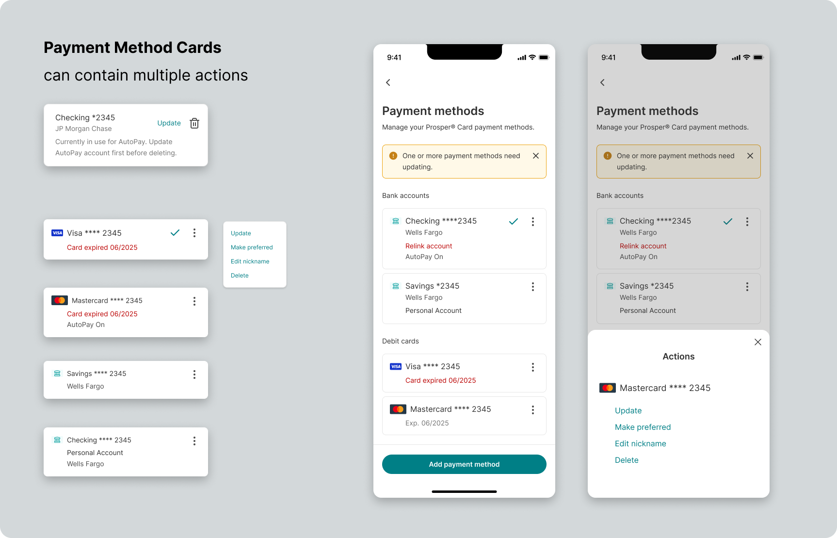
I explored a component that could be used in both the manage payment methods section (shown here) as well as in the select payment methods sections to reduce the need for 2 different components (a payment method tile and a radio select tile). It was ultimately determined to be out of scope for this project and shelved for potential future exploration.

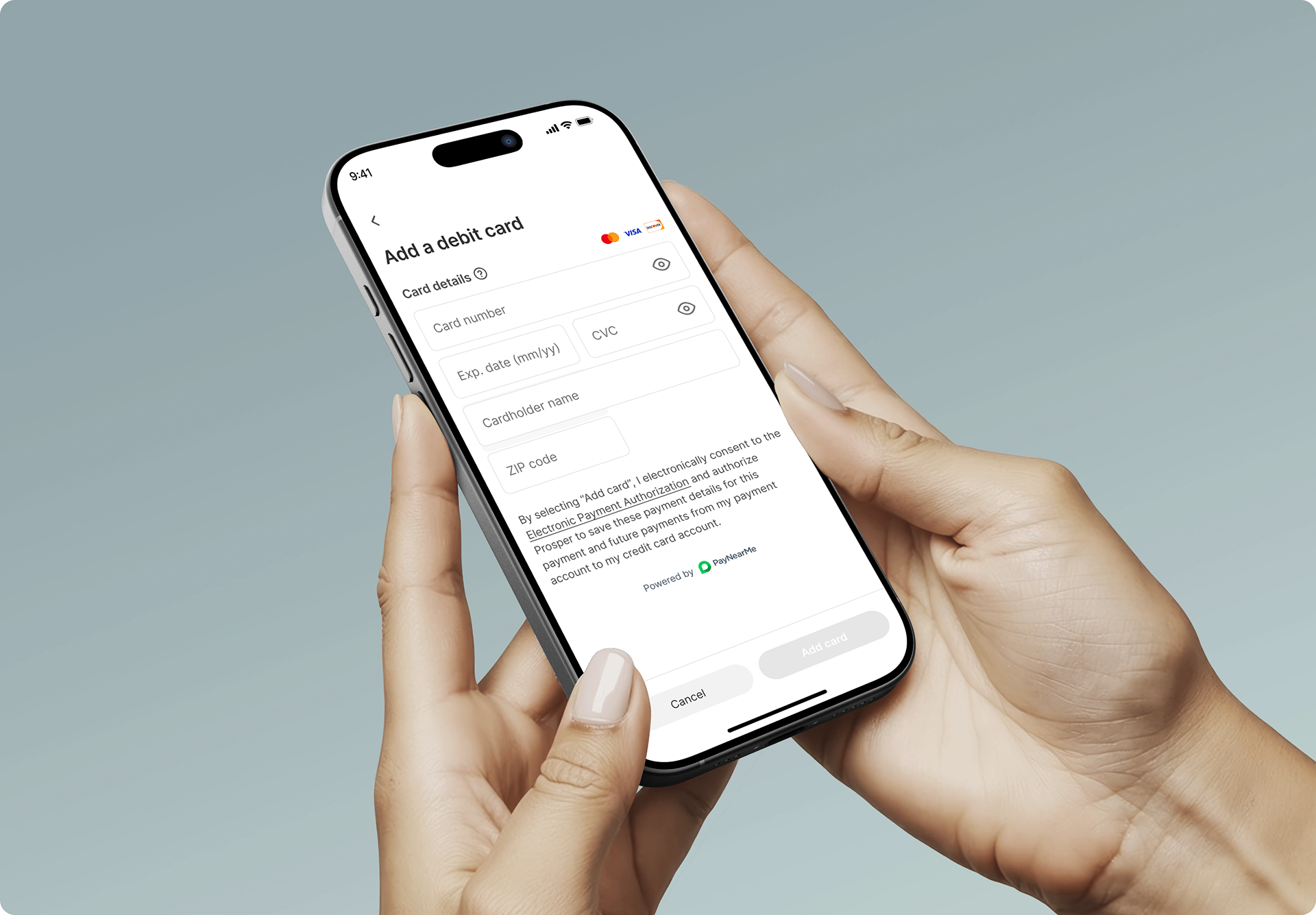
The new debit card input screen designed for desktop and mobile.

The final select payment method screen showing the debit card network logo.
The work expanded the platform's digital payment capabilities while creating a more flexible experience for customers. It also established reusable UX patterns that could support future payment experiences rather than solving for a single isolated transaction.