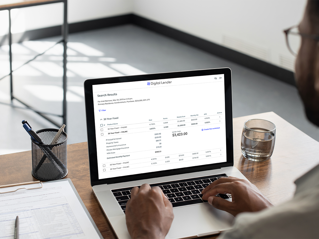
Yodlee, a leading cloud-based platform driving digital financial innovation, had produced a suite of personal finance management applications for their B2B finance platform suite. What was missing was a single dashboard for the end user, both as a way to see a summary of their finances, and as an entry point to access the applications.
Yodlee had produced a suite of apps for retail and "wealth" users. In order to discover what configuration would be most optimized for their users' experience,
I was tasked with creating a series of desktop, tablet and mobile dashboard screens for usability testing the retail user experience.
Yodlee had produced a suite of apps for retail and "wealth" users. In order to discover what configuration would be most optimized for their users' experience,
I was tasked with creating a series of desktop, tablet and mobile dashboard screens for usability testing the retail user experience.
For Retail users, the hierarchy of importance of the different applications were: Account Summary, Alerts, and Transactions were most important. Followed by Expense & Income Analysis, and Cash Flow. The lowest of importance would be Net Worth and Investment Holdings.
The dashboard requirements for Investors needed to show an account summary, alerts, net worth, investment holdings, transactions, cash flow, an expense analysis, and potentially, budget. Information regarding net worth and investment holdings would be more important to wealth users than retail, who's primary concerns were account balances, paying bills, and reviewing transactions.
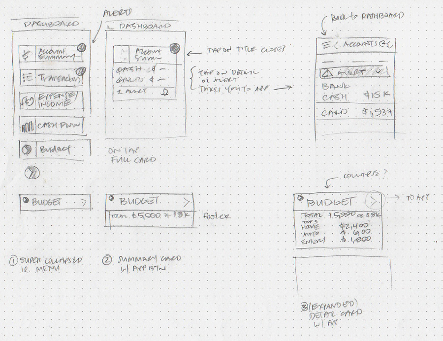
Early sketch showing how I was thinking of showing some components that expanded to show more information while remaining on the dashboard.

Exploration sketches of a responsive menu that contained a 2nd tier of information to be shown when tapped, with alerts and badges (in red ink).

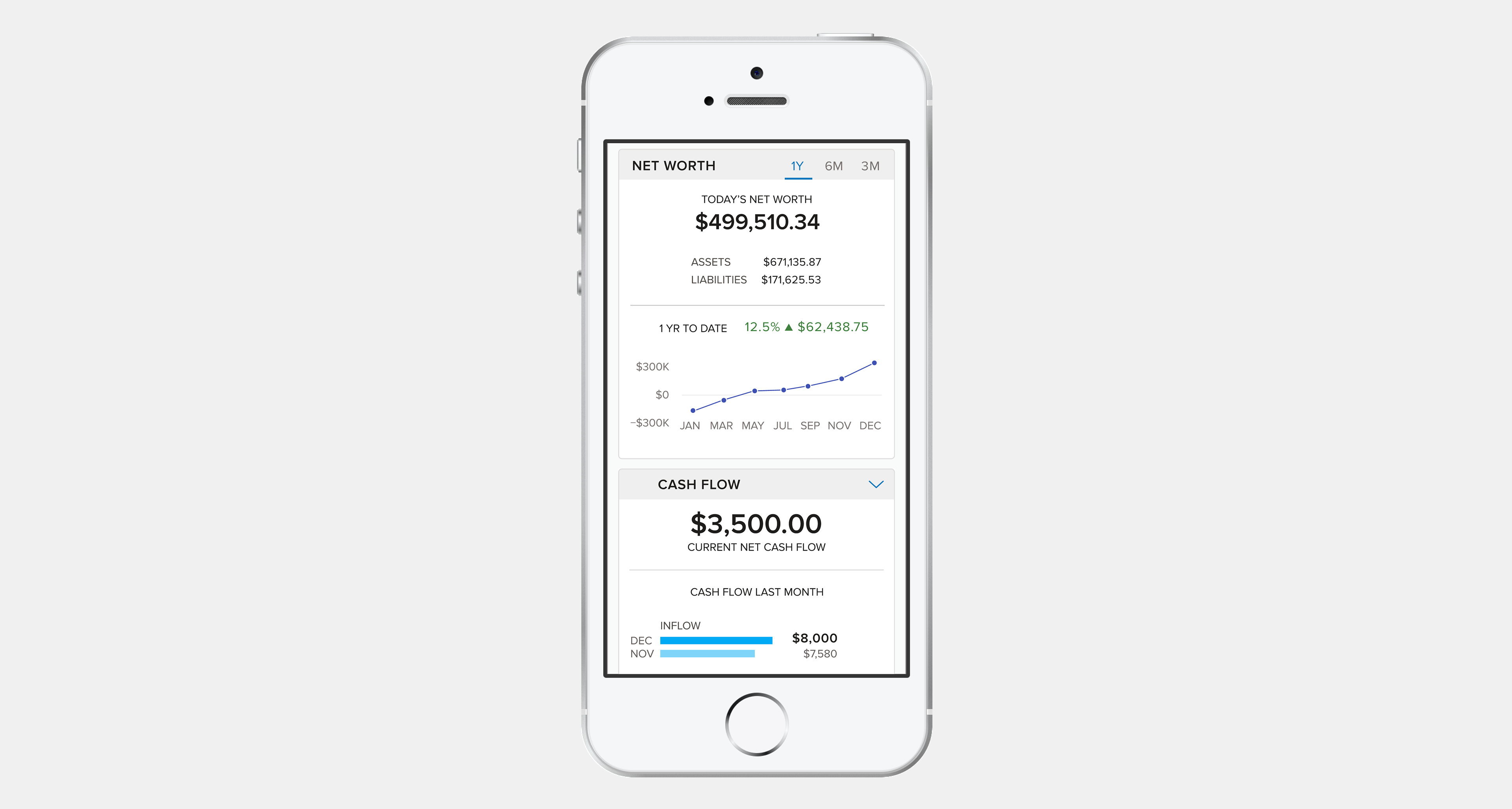

The dashboard's success was proven as it was adopted by Innovation Partners to offer to its advisors and end clients access to Yodlee’s financial wellness solutions through Envestnet’s Investor Suite. Clients were subsequently able to aggregate personal finance data from all of their accounts into a single, easy-to-navigate dashboard. Yodlee was later acquired by Envestnet in 2015.